Frutola
Client

Building a fresh identity from name to bottle
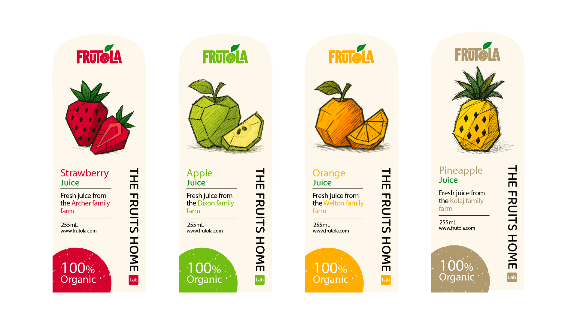
Frutola is a complete brand identity project developed from the ground up from naming and logo design to packaging and 3D visualization. The concept captures the freshness and honesty of natural juice through a clean, playful organic visual language.The name Frutola combines the words fruit and ola (meaning "wave" or "flow"), reflecting the brand's natural energy and joyful tone. The logo carries a simple, hand-drawn aesthetic paired with vibrant color accents to emphasize freshness and approachability. Each juice flavour features its own geometric fruit illustration and coordinated color scheme. creating a strong, recognizable identity across the range. The goal was to design a brand that feels modern, authentic and rooted in nature one that visually expresses purity, craftmanship, and the joy of healthy living.


